
[:es]
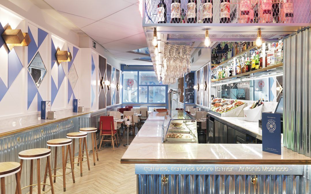
La colorimetría para restaurantes puede ser determinante en el éxito de un negocio gastronómico. ¿Sabías que hay colores que abren el apetito o que influyen en la comodidad de los clientes? El color es una gran herramienta que hay que saber usar para lograr los objetivos de un restaurante. Y es que la elección del color en un restaurante afecta no solo a la comida, sino también al color de la carta, del logo, de la decoración del interior y de los baños, por eso, vamos a profundizar en la psicología del color y ver qué colores son los más recomendados para este tipo de negocios.


Colourimetry for restaurants can be a determining factor in the success of a gastronomic business. Did you know that there are colours that whet the appetite or that influence the comfort of customers? Colour is a great tool that you have to know how to use to achieve the objectives of a restaurant. The choice of colour in a restaurant affects not only the food, but also the colour of the menu, the logo, the interior decoration and the bathrooms, so let’s delve into the psychology of colour and see which colours are the most recommended for this type of business.
LA IMPORTANCIA DE LA COLORIMETRÍA EN LOS RESTAURANTES – PARTE I
La colorimetría para restaurantes puede ser determinante en el éxito de un negocio gastronómico. ¿Sabías que hay colores que abren el apetito o que influyen en la comodidad de los clientes? El color es una gran herramienta que hay que saber usar para lograr los objetivos de un restaurante. Y es que la elección del color en un restaurante afecta no solo a la comida, sino también al color de la carta, del logo, de la decoración del interior y de los baños, por eso, vamos a profundizar en la psicología del color y ver qué colores son los más recomendados para este tipo de negocios.
Kai Restaurant design by Nayra Iglesias – hola@inoutstudio.com
Consejos a tener en cuenta a la hora de elegir el color
- El tipo de restaurante: Los colores deben ir en concordancia con el concepto, la especialidad o la temática del negocio, así como con la distribución del local y el mobiliario.
- La marca: Debes tener bien definida la identidad de tu restaurante, ¿qué concepto quieres transmitir a tus clientes? Traduce tu restaurante en un sentimiento y después busca el color ideal para lograrlo,
- El tamaño: El uso de los colores puede ayudarnos a hacer que un espacio parezca más pequeño (colores oscuros) o más grande (colores fríos en tonos claros) de lo que es en realidad.
- La iluminación: Ten en cuenta la cantidad de luz natural que tiene el restaurante, si tiene poca, lo más aconsejable es el uso de tonos claros y cálidos (blanco), y si tiene un exceso de luz usa tonos fríos (azul).
- El público objetivo: ¿Cuál es tu público objetivo? Debes enfocarte en tu público potencial y no solo para cumplir con sus necesidades gastronómicas, los colores y una decoración adecuada, te ayudarán a atraerlos y fidelizarlos.
Sala Salada restaurant design by Nayra Iglesias – hola@inoutstudio.com
- PRIMARIOS son aquellos que no pueden obtenerse de la mezcla con ningún otro color. AMARILLO / CIAN / MAGENTA
- SECUNDARIOS son aquellos que se obtiene mezclando 2 primarios al 50%. VERDE / VIOLETA / NARANJA /
- INTERMEDIOS mezclando un primario y un secundario. AMARILLO-VERDOSO / AZUL-VIOLETA / ROJO-ANARANJADO, etc
- COLORES FRÍOS cuando en su composición interviene el color azul. Pertenece la gama de colores comprendida entre el AMARILLO-ROJOVIOLETA
- COLORES CÁLIDOS cuando en su composición interviene el color rojo y el amarillo. Pertenece la gama de colores comprendida entre el AMARILLOVERDOSO-VIOLETA
Hospitality design by Nayra Iglesias – In Out Studio | hola@inoutstudio.com
¿Conoces nuestros conceptos de Hotel Boutique?
LE SUD SUITE | VIOLET BLISS | Coming soon…
[:en]THE IMPORTANCE OF COLOURIMETRY IN RESTAURANTS – PART I
Colourimetry for restaurants can be a determining factor in the success of a gastronomic business. Did you know that there are colours that whet the appetite or that influence the comfort of customers? Colour is a great tool that you have to know how to use to achieve the objectives of a restaurant. The choice of colour in a restaurant affects not only the food, but also the colour of the menu, the logo, the interior decoration and the bathrooms, so let’s delve into the psychology of colour and see which colours are the most recommended for this type of business.
Kai Restaurant design by Nayra Iglesias – hola@inoutstudio.com
Tips to keep in mind when choosing a colour
- The type of restaurant: The colours must be in accordance with the concept, speciality or theme of the business, as well as with the layout of the premises and the furniture.
- The brand: You must have the identity of your restaurant well defined, what concept do you want to transmit to your customers? Translate your restaurant into a feeling and then look for the ideal colour to achieve it,
- The size: The use of colours can help us to make a space seem smaller (dark colours) or bigger (cold colours in light tones) than it really is. Lighting: Take into account the amount of natural light that the restaurant has, if it has little, it is best to use light and warm tones (white), and if it has an excess of light, use cool tones (blue).
- The target audience: Who is your target audience? You must focus on your potential audience and not only to meet their gastronomic needs, colours and an appropriate decoration will help you to attract them and build their loyalty.
Sala Salada restaurant by Nayra Iglesias. hola@inoutstudio.com
- PRIMARY colours are those that cannot be obtained by mixing with any other colour. YELLOW / CYAN / MAGENTA
- SECONDARY are those obtained by mixing 2 primaries at 50%. GREEN / VIOLET / ORANGE /
- INTERMEDIATES are obtained by mixing a primary and a secondary. YELLOW-GREENISH / BLUE-VIOLET / RED-AN ORANGE, etc.
- COLD COLOURS when blue is involved in their composition. It belongs to the range of colours between YELLOW-VIOLET RED.
- WARM COLOURS when their composition includes red and yellow. It belongs to the range of colours between GREENISH-YELLOW-VIOLET.
Hospitality Design by Nayra Iglesias. hola@inoutstudio.com
Do you know our Hotel Boutique concepts?